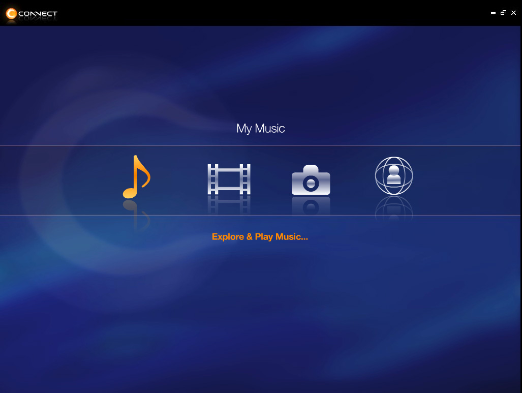
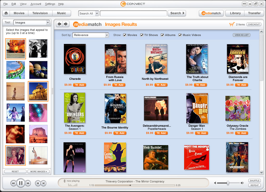
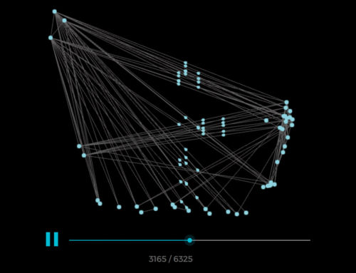
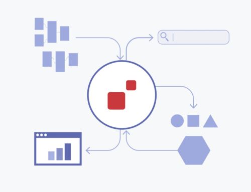
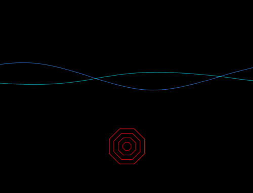
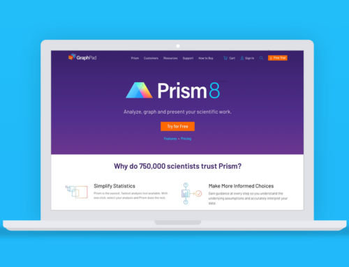
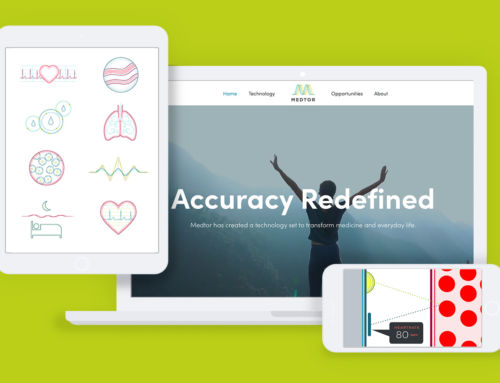
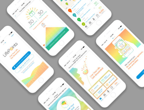
- Welcome screen.
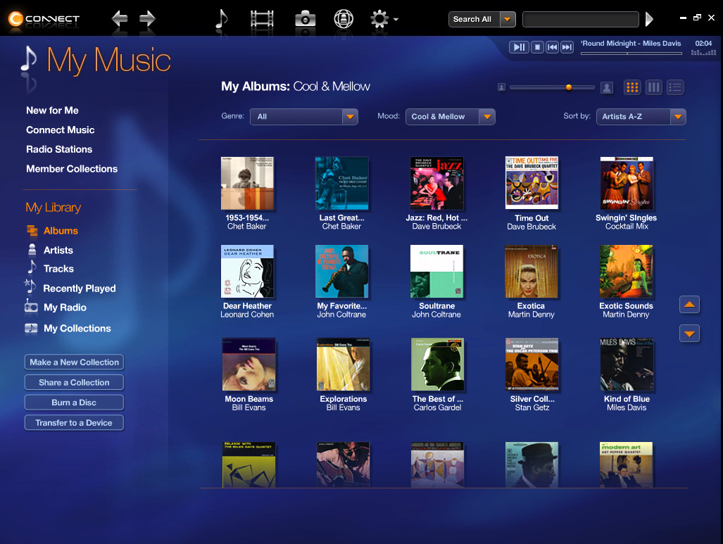
- Music browsing
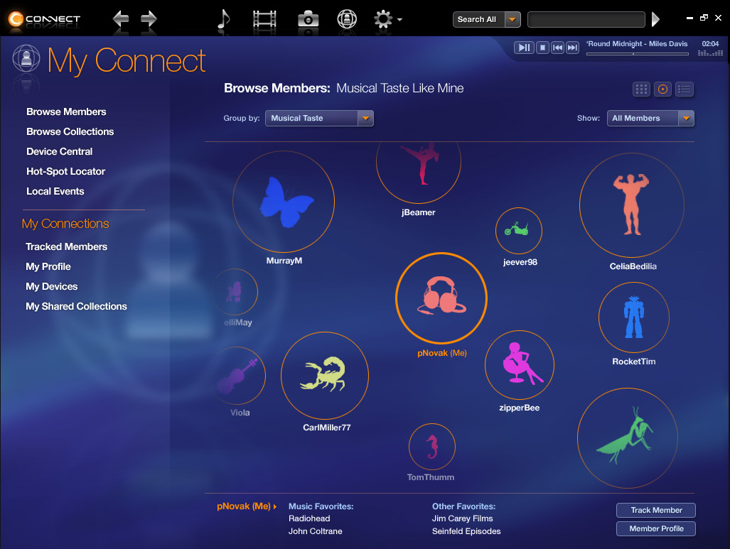
- Prototype for a way to discover users with similar tastes.
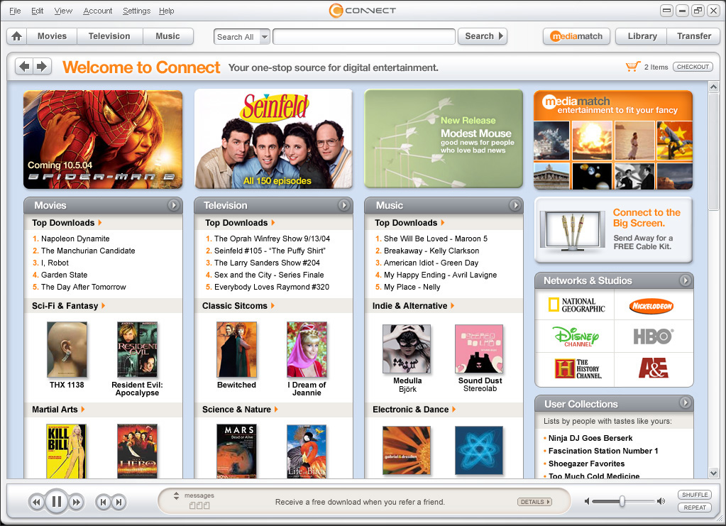
- Prototype for an online media store
- Prototype for a new type of media discovery tool.
Sony Connect
As you may recall, when Apple was first getting started as a digital media retailer, they weren’t alone. Companies like Sony knew they had to act fast if they wanted to meet the growing consumer demand for music and video downloads and also compete with Apple’s ever-expanding iTunes service.
A beta release of Sony’s online media store – called Connect – was proving to be a usability nightmare so they enlisted the help of IPK, the user-experience consulting group I’m a part of. As the lead designer for the team, I helped to develop discovery tools and social networking features that might propel the service into the future. We created several prototypes to re-think how music and movies could be organized, presented, and shared.
As a follow-up project,we re-designed the existing service to better facilitate the sale and management of content. This basically amounted to a reverse-engineering of the iTunes user experience which gave me the opportunity to closely understand and possibly improve upon the innovations coming out of Cupertino. Unfortunately, despite the cleaned up interface, and the valiant efforts of some sharp brains, the Sony Connect experience proved to be overly burdened by device compatibility requirements, an unwieldy rights-managment model, and conflicting interests within the company. The weight of all this was ultimately felt by the user, compelling them to turn elsewhere to quench their thirst for digital entertainment.
For me, this was a great lesson in how the process of designing an on-screen interface can be used to uncover and clarify big-picture strategic issues.

