Apple unveiled the glamorous new Apple Watch on September 9, but they failed to mention what resolution the screen would have. For designers looking to start creating apps for this fancy little device, we’re left with the question: “What size do I make my comps?” Let’s see if we can put on our smarty-pants and solve this mystery right here.
Some might say resolution-dependent comps are a thing of the past in this multi-device era of liquid responsiveness, but I still like to use Photoshop to quickly set up an initial visual style. With that said, let us begin.
Firstly, how big is the screen? Already, we have a trick question. There are two sizes! A manly 42mm version as well and a dainty 38mm for the ladies. By performing a highly unscientific analysis of the screenshots from the Apple website, we can get a good idea of the aspect ratio and then the width.
Next question: Do the two sizes have a different resolution? Or, to rephrase it, would Apple really add hours of frustration to the lives of developers and designers, just for 4mm? Let’s hope not, and assume they both display the same pixel dimensions, and that the small one’s just a little crisper than the big one.
That still doesn’t tell us much about the actual pixel density. But neither did Apple. And that actually does tell us something. It means there was no major breakthrough in screen resolution to get a display to fit onto your wrist. If there was, we would have heard the disembodied voice of Jony Ive waxing poetically about it over semi-pornographic close-ups of polished aluminium chip-faces.
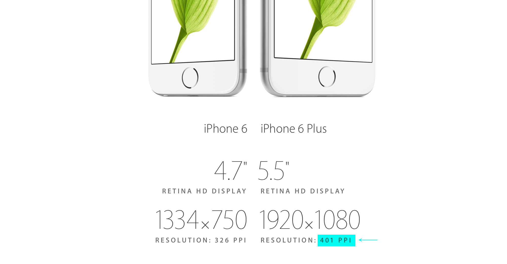
So if it wasn’t a big breakthrough, then surely they’d use the best they’ve got – especially if they’re concerned about maximizing the legibility of typefaces at such a small size. So the best they seem to have available was unveiled the same day for the iPhone6 plus.
So assuming the smallest size device (32.3mm x 38mm) is using the best possible resolution (401ppi), we can quickly run the numbers through Photoshop’s image size dialog.
Flipping the millimeters to pixels shows a resolution of 509 x 600. 600 is a remarkably elegant number, but I’ve never heard of an odd number of pixels on a screen, so I’ll assume my measurements were off by a bit and call it:
510 x 600
UPDATE: September 15, 2014
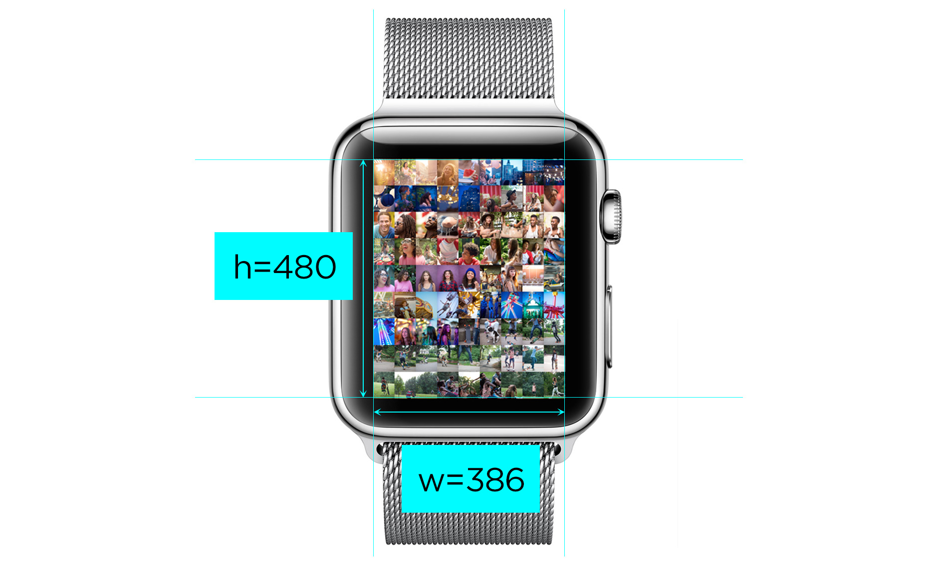
Something important that was brought to my attention in the comments is that the entire watch face is not used for the display. There’s actually a generous black border around the rendering area. Once we take that into account, using the same 401ppi resolution for the 38mm version, we get a height of 480px (another number that commonly occurs in display sizes). The final dimensions then come out to:
386 x 480
UPDATE: January 23, 2015
The answer to this question was answered when Apple released the Apple Watch SDK in November 2014. The correct answer is:
272⨉340 and 312⨉390
Thank you for playing.








I think display sizes usually quoted as the diagonal rather than the height. Here is a comparison of the phones: https://www.evernote.com/l/AIC6Ti4ahCZPN5hdbShl_cbS1b92_5fvlQQA
Might need to refiddle the numbers just a bit :)
The graphic says “38mm (height) and “42mm (height)” – plus they’re using metric for measurements! I guess watches are special.
Indeed, you’re correct. Watches must be special. Maybe it is a bit of the horological deference Jony Ive was talking about. I found a related post which is fun reading: http://www.paulsprangers.com/2014/09/apple-watch-dimensions/
As a programmer I’d be surprised if the width were not a power of two so a width of 512 pixels wide (which would also be the number of pixels in the width of the original Macintosh screen) would make a certain amount of sense.
It may actually be something like 480, since there seems to be quite a bit of space between the screen and the edge of the device based on the “Photo” face shown on http://www.apple.com/watch/design/ (which presumably uses as much real estate as it can muster.
Looking at the introduction video on http://www.apple.com/watch/films/ (the 2nd one with Sir Jonny) at 1:22 we see photos and it appears that the width and height of the visible area of the screen are as wide and tall as the straight edges of the case (in other words deduct the curved part of each of the corners).
Looking at that video the margin between case and visible area seems to be greater horizontally, so a metric of 480×600 would make sense.
I will venture a prediction that the 38mm display is 480×584, and the 42mm display is 512×600.
Seems like a pretty good guess. Maybe there should be a prize for the winner.
You’re right about the watch not using the full screen real estate. Need to take a closer look. I still don’t think the 2 sizes will have different pixel dimensions though.
I agree, there is enough complexity in the Apple Watch offering that it makes more sense to pick one resolution and have both sizes use it for consistency. Looking at the introduction video again I found that the image painting all pixels (the photo display) seemed to be 240×300 as displayed in the video.
I amend my earlier prediction: the Apple Watch displays will be 480×600 pixels for both sizes with the margin on each side of the display (between the edge of the display area and the edge of the faceplate) being 1/12 of face place width and height on each edge.
480×600 display offers a good balance allowing stunningly crisp display on the larger screen, while allowing an achievable target for pixel density on the smaller one. Still higher pixel count than the 512×384 found in the original Macintosh. One could theoretically write a Macintosh emulator for the Apple Watch which could display the full Macintosh screen in miniature and run classic Mac software orders of magnitude faster than the original Macintosh.
Hey Jay, this image of the Photos app might be something that could help you: http://images.apple.com/watch/features/images/face_photos_large_2x.png (pro tip: you can append ‘_2x’ on any URL on the Watch site to get big versions)
That’s a useful tip! That image seems to have a 280×350 image, but agree with JWorth that they will likely make both devices the same size.
Interesting that the image Ben found does not show the rounding that was evident in the /watch/films/ on the Apple site. Either Ben’s image was a mockup or capture from an emulator during development, or perhaps the display rounding was added later via software or hardware to better aesthetically match the rounding of the case itself.
Almost immediately after posting the reply with my “final answer” (480×600) I was staring at your measurements on the face of the 38mm model and it made even more sense, jibbing perfectly with what I saw on the stills and in the promotional film on Apple’s site.
With a height of 38mm, allowing 4mm margin top and bottom that leaves 30mm, divided by 600 pixels gives a nice even spacing of 1/20th of a mm (50 microns) per pixel. Multiplying 0.05mm by 480 we get 24mm wide viewing area and this jibes perfectly with the observation from images on the Apple site that there is slightly more margin between case edge and screen edge horizontally than vertically.
I’d love to see the early mac emulator as a watch app. Please get to work on that.
Thanks Ben and Jay for your helpful input. My new guess is 386×480 (see above)
I took a stab at guessing myself a few days ago. I used some macro shots of the Watch to determine the resolution. You might enjoy the read: http://www.paulsprangers.com/2014/09/apple-watch-screen-resolution-estimate/
unfortunately your resolution estimates are likely very high. The resolution may just be about the same as sony and samsung. After all, battery life is a huge problem for these devices, and the more pixels, the more battery drain. Given that it can’t even hold a day, i am sure the power people put their foot down and forced a compromise on this issue. until we see better battery densities, wearable computers are going to be a serious compromise, so my estimate is 320 in the larger dimension. 600 is completely out of the question.
Your reasoning about battery life is good, and a dot pitch of 400ppi may be overkill for a watch. If your prediction of a 320 pixel height is correct, based on a 1.25 to 1 height to width ratio observed in all the artwork on Apple’s site, that would give a screen resolution of 256 x 320 (the appearance of higher resolution may be based on a combination of anti-aliasing during image enlargement coupled with a fair about of wishful thinking on our parts). I’m hoping for a 480×600 or better, but 256×320 is nothing to sneeze at.
At 256×320 the 9×9 grid of photo thumbnails would make them about 28×35 pixels each, which is almost the size of the original Macintosh icons (which were 32×32). If Apple wants me to write that Classic Macintosh emulator for the Apple Watch they will have to give me at least 384×512 to work with however (and I used to spend so much time in Macsbug on my Mac Plus that I could look at a hex dump and read the actual machine language instructions and some of the system calls in the compiled code, so it isn’t out of the question..hope Tim Cook is following this thread! :D)
I would expect 240×320 in both sizes.
Based on the screen sizes from Paul Sprangers and the pixel dimensions from WatchKit, the display density calculates out to 326 ppi, same as the retina iPhone 4 or 5 displays.