I remember the first time I looked at a blog. It was a tech blog by an engineer I worked with in the late nineties. I remember being very confused, not by the words that were written, which were fine, but by the format itself. I couldn’t figure out why the thoughts were going backward in time as I read down the page.
When you read a page in a magazine or a book, the thoughts and paragraphs proceed in an orderly fashion from top to bottom. The words and letters in front of you all occupy and represent a single, static piece of space-time real-estate.
This “blog” thing, with its stupid name, had the entire concept of how to visually represent linear thought completely wrong. Why was I being asked to swim upstream in a writer’s stream of consciousness? Was this some kind of Japanese invention created by people who were used to reading their comic books backwards?
It was only when I took note of the date-stamp on each titled paragraph that I realized I was supposed to be reading this with a completely different mindset. The bold titles weren’t subheads leading me into a subsequent idea, but rather an indicator of a completely separate thought that occurred and was published at some other time entirely. I needed to discard the top-down sorting paradigm of the printed page and replace it with a time-inclusive method, like the one I used for reading my email inbox or the posts on a message board.
Which Way is Up?
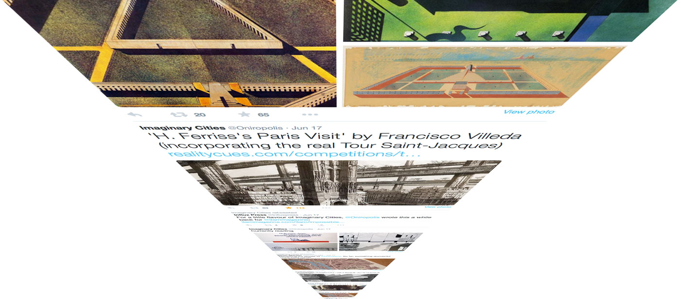
When it comes to representing or understanding time in a digital designs, we really don’t know which way is up. Which direction represents the past and which is the future? Is the future the thing we just read at the top of the page, or the thing waiting for us down at the bottom? In an instant message thread, the next message appears at the bottom of the screen, while the ones from the past scroll to the top. On social media feeds, the exact opposite is true.
Even today, Apple mail lets the user have the final say on which way is up.
Newness and Nowness
Over the course of the past 15 years we’ve all internalized the “newest-on-top” method of info-consumption to the point that it’s become a core component of online literacy. Facebook, Twitter, Reddit, Tumblr, and pretty much every blog or news outlet is presented in the form of a “feed” where the words that get top billing are the ones that were uttered just now.
In a feed, it doesn’t matter if it’s a political headline, a witty comment about what’s on TV, a photo of your neighbor’s remodeled kitchens, or the results of your seventh-grade science partner’s “what condiment are you?” quiz. If it’s new, it belongs on top. We remain perpetually enticed by the possibility of something revelatory appearing in the next nanosecond.
The feed-form, to its credit, eliminates the illusion that the future is something we can know or discover. The future has no place in a feed. It’s a design that encourages us to be conscious of the present moment, to embrace the “Now,” and keep our minds from drifting into temporal realms over which we have no control. Just as you can never truly predict what will happen in the next moment – a fly might land on you, the power might go out, you might have a brain aneurism, etc. – you can never scroll upwards any further than the top of the page. “What’s coming next?” you ask? On a printed page, you simply scan down the page to find out. But with a web feed, the future is, quite accurately, the thing that hasn’t yet happened. Or at least the thing that hasn’t yet loaded.
With the never-ending updates appearing at the top, it’s not the unfolding of a story that compels us to continue reading downwards, it’s the fear that we might’ve missed something. We scroll down into the past, scanning the headlines, hashtags and summaries for some important item that we should probably pretend to care about if anyone asks. The further down we go, the less relevant things feel. We begin to smell the dank must of yesterday’s news. Sure, it’s fun to delve into the archives of someone’s blog (try it!) – but the deeper we dig, the more we begin to feel the suffocating weight of the ever-growing mountain of nowness on the surface above. So we look around for some “back to top” arrow that can sling us back to the action on the front lines of the headlines.
By feeding into this fear of missing out, (or “FoMO” as annoying people refer to it), the feed-form has taken a toll on the modern psyche by removing the sense that the future and the past are stationary items that we’re free to access whenever necessary. Unlike a page made of paper, which acts as a permanent record of a particular moment, a feed-form web-page is a moving vessel headed for the future, leaving the past in its wake.
It’s only once you pluck an item from the ever-flowing data-river and immerse yourself in a story or article that you’re able to resume the downward progress through a static record of sequential ideas.
They lived happily ever after. Once upon a time.
Presenting new information at the top of a page is a fine and sensible idea, of course. Most importantly, it encourages users to keep coming back to see what’s new. But I wonder if my initial confusion about how to read that first blog was really just a jolt to my internal sense of how to read a story.
Our brains are constantly looking for connections between bits of information to try and form them into a larger, coherent pattern. If the snippets fit together in a satisfying, harmonious way, they form a story. And the order in which details are presented is a key component of any good story. (If you doubt that, try binge-watching all episodes of Breaking Bad in reverse order.)
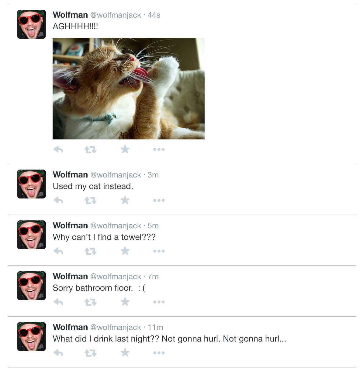
That’s why I’m always curious about why people seem so unfazed when a feed presents the end of a story before the beginning. Like if your friend live-Tweeted his hangover a few hours ago, you would see:
And, much like the heroes of the 2010 R-rated comedy hit The Hangover, we’re forced to re-assemble the story using the fragments of information we can pick up as we stumble around. The timeline of events and the trajectory of memory are laid out in opposite directions. There are no surprise endings, only surprise beginnings.
The ancient ability to assemble thoughts and events into a story allows us to find their hidden meanings, subtexts and thematic connections. By regularly exercising a tool of online literacy that requires us to discard our natural sense of story structure, are we unwittingly diminishing the very mechanism by which we process and understand the chaos around us?
Only time will tell, I guess. I’ll post any new findings at the top of my blog.






Stop. My mind hurts.
Now I wonder if this comment will appear above or below the last one…
hhahahaha me to lol
It appears on the top! I am reading you in 2020 :P
I never thought I’d read a blog post where someone said the thing outloud that has existed in my brain.
I am still confused when I’m on a blog and I see “previous” and “next”, for similar reasons: Is previous the previous page, or previously posted? Is next the next page, or the next ones posted. I always feel like I’m Johnny Knoxville in the movie Big Trouble (https://youtu.be/EjHHzZAUxbM?t=5m1s)
I think the problem is that we still haven’t figured out how to use a digital space as its own medium for communicating. We have all four cardinal directions to work in, and still the idea of layering. We can communicate stories in a much more complex way that would be unique to the digital space. If we can first get our minds out of thinking like print.
Well said. I have the same problem with the “previous | next” links. The “older pasts | newer posts” option works a little better but should it actually be “newer posts | older posts” since you’re actually going backwards/upwards through the list of posts?
I’ve only been on one or two blogs where they actually labelled their previous/next links in a way that didn’t confuse me – and they did exactly that: “newer posts, older posts”.
I really do think that part of the challenge is that the digital medium doesn’t have a physical space restriction – like print does. The print medium has deeply impacted how we consume content: We read left-to-right, top-to-bottom.
In a physical environment, when we finish a page, we must turn that page from right to left – or move our eyes from the left to the right. That’s what causes us to think that “previous” goes on the left side, and “next” goes on the right; it’s a poor analog to turning a page.
Books don’t have infinite paper; the physical limitations of paper size and quantity created this idea of turning pages – which has caused us to associate “next” with the right side.
If you take a step back further in time, there were actual, In Real Life scrolls. If you read a Hebrew scripture, that’s from right-to-left, and to get more content, you keep on scrolling! The next content is just at the bottom. period.
Where we’re stuck (or at least, where my brain is stuck), is this:
the sun starts in the east, moves to the west (right-to-left, or left-to-right, depending on where you’re standing)
“Clockwise” -> right to left, top to bottom
plant growth: newer part of the plant at the top, older part at the bottom… unless it’s a root.
We have really solid, well-established analogs for content – but not for time.
Previous and Next are content-based terms. Newer and Older are time-based terms, and the association with time is much more culturally-based
You’re right. When it comes to depicting time in space, there’s nothing familiar to turn to. To make it more confusing, apparently everyone has a slightly different internal picture of how the past, present, and future are situated in space. There’s a good chapter on the subject in this book if you’re curious.: http://amzn.com/0062225200
“older pasts” – truth in typo
How’d I get here?
I must be hella dumb. Cause reading two people hold a completely valid, intelligent blog about …well, blogs; where I was teetering on my grasp of understanding and shamefully had to reread a couple time…..wow!! Fun. But I feel dumbish. I think it actually kinda gave me a headache….I’m going to bed now :)
Now I want to binge-watch all Breaking Bad in reverse order. And it will have been only your fault.
as I get to the end of this comment section I realize that most comment sections are patterned oldest to newest, but if you go back to the content its newest to oldest. The layout of most sites is confusing to start with and then inconsistent after that. What the heck internet.
And for some reason I feel like I should apologize for commenting on a blog that’s from a year and a half ago, like it’s not acceptable to engage the past because it can’t possible be relevant to our present. That’s dumb, I don’t like how we have been conditioned in this way.
Ok that was mind bending
[…] 🗞 The Infinite Scroll (Read Here) […]
I… Whaaaaaat? My brain hurts.